


Tapatalk, Android’s most popular app for browsing forums, recently received another refresh to its interface with little initial fanfare. It was not a milestone update and the overall look of the app was not drastically changed from its past few updates. The way you navigate within a site, though, has been altered significantly. Judging by Play Store reviews, Tapatalk’s feedback board, and our tips inbox, users are not fans of this update whatsoever.
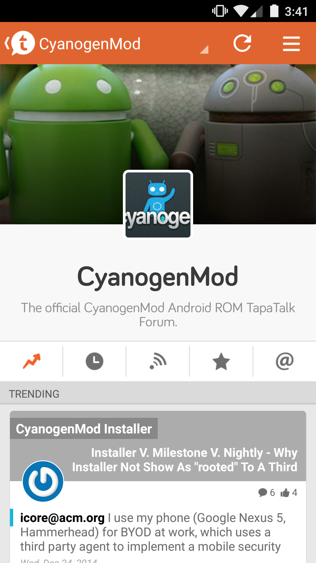
From the start, frequent users of Tapatalk will notice the extent of the changes. The main pages for each individual site have a different appearance, prioritizing trending discussions.


There are five tabs on this screen:
There is a slide-in menu to the right with a handful of other places you can go, like private messages and site-specific settings. On their company website, Tapatalk says this menu will be seeing further tweaks, enhancements, and improvements in the future as they figure out how best to utilize it. While not abundantly useful, this menu is not too offensive.

The largest number of comments are regarding the way you navigate the various subforums within a site. It is particularly difficult on sites like XDA Developers, which have a very large number of sections. You may not even notice the crude implementation without being told where to look.


Press the site’s name on the orange bar on the top of the screen and a dropdown list of subforums will appear. If you have subscribed to any, they will appear at the top of the list; this is perhaps the most thoughtful aspect of the new navigation features. If you don’t like the way the subforums are arranged, you’re out of luck. The sorting features (for instance, alphabetically) present in previous versions of Tapatalk are absent. You cannot tell whether a given subforum has new posts from here as was possible before.
A company representative on Tapatalk’s support site commented on this feature specifically:
Navigation has been moved up to the top of the screen and in my opinion suffered the most in the transition. The old method of navigation worked ok but was not very intuitive either, it's just something many forum goers have gotten used to (being one myself, who has been using various forums for well over 10 years now). This is where I think it's clear to admit, the change was an effort to make forum navigation a more separated experience that isn't crucial to experiencing the app mainly so forum newbies wouldn't be overwhelmed.
However any intention to overly obscure or remove any functionality was not intentional but an unfortunate process of trial and error in design. This is closely being looked at to make sure it is AT LEAST on par with our old navigation in terms of features and performance, and I believe will be corrected quite a bit going forward.
A variety of other complaints have come up in various venues, but these are chief among them. People are bound to nitpick about certain things, but the issues I’ve covered here are obviously legitimate problems and concerns shared by a large portion of users. Tapatalk is feeling the heat, too, as evidenced by a flurry of 1- and 2-star reviews. See below for a sampling:

Tapatalk is clearly aware of all these problems, but they aren’t going to be reverting to their old interface. It has been 10 days since the latest update rolled out, but it is worth keeping in mind that the holiday season makes it a challenge to push these big fixes in a timely manner. Soon, though, they will have to patch things up.
If you want to go back to version 4.9.5, which is the most recent update before the major navigation changes, you can download it at APK Mirror. You will have to uninstall Tapatalk first and sign in again once you have installed the 4.9.5 version.
From the start, frequent users of Tapatalk will notice the extent of the changes. The main pages for each individual site have a different appearance, prioritizing trending discussions.

There are five tabs on this screen:
- Trending discussions
- Timeline of most recent posts
- Unread posts
- Subscribed threads
- Participated threads
There is a slide-in menu to the right with a handful of other places you can go, like private messages and site-specific settings. On their company website, Tapatalk says this menu will be seeing further tweaks, enhancements, and improvements in the future as they figure out how best to utilize it. While not abundantly useful, this menu is not too offensive.

The largest number of comments are regarding the way you navigate the various subforums within a site. It is particularly difficult on sites like XDA Developers, which have a very large number of sections. You may not even notice the crude implementation without being told where to look.


Press the site’s name on the orange bar on the top of the screen and a dropdown list of subforums will appear. If you have subscribed to any, they will appear at the top of the list; this is perhaps the most thoughtful aspect of the new navigation features. If you don’t like the way the subforums are arranged, you’re out of luck. The sorting features (for instance, alphabetically) present in previous versions of Tapatalk are absent. You cannot tell whether a given subforum has new posts from here as was possible before.
A company representative on Tapatalk’s support site commented on this feature specifically:
Navigation has been moved up to the top of the screen and in my opinion suffered the most in the transition. The old method of navigation worked ok but was not very intuitive either, it's just something many forum goers have gotten used to (being one myself, who has been using various forums for well over 10 years now). This is where I think it's clear to admit, the change was an effort to make forum navigation a more separated experience that isn't crucial to experiencing the app mainly so forum newbies wouldn't be overwhelmed.
However any intention to overly obscure or remove any functionality was not intentional but an unfortunate process of trial and error in design. This is closely being looked at to make sure it is AT LEAST on par with our old navigation in terms of features and performance, and I believe will be corrected quite a bit going forward.

Tapatalk is clearly aware of all these problems, but they aren’t going to be reverting to their old interface. It has been 10 days since the latest update rolled out, but it is worth keeping in mind that the holiday season makes it a challenge to push these big fixes in a timely manner. Soon, though, they will have to patch things up.
If you want to go back to version 4.9.5, which is the most recent update before the major navigation changes, you can download it at APK Mirror. You will have to uninstall Tapatalk first and sign in again once you have installed the 4.9.5 version.