


I'm OCD'ing on that, too, but this layout feels better to me. It's easier for me to skim through the larger cells than it was with the lined list.
Also, what do you guys think about a possible reordering of the categories?
- AltTabMe Fundraisers
- priority due to expense coverage; temp category; targets all members and guests.
- Play with the Community
- Read Me and New Apps should be easy to find for those unfamiliar with the site.
- General Discussion
- I'm torn between this and "All the Games" for #3. I want to say that ATG is more of a draw for new people, but I feel like General Discussion is the meat of the forum. ATG would prioritize interest for new people - GD would allow existing members to scroll less?
- All the Games
- Or swap this with General Discussion from this list.
- Rants
- Private TAB Member Forums
- Website Related
- News, Video and Podcasts
- There's even a CTA to Subscribe on YouTube at the end here. Always good to end with a CTA. Plus, if a new user is visiting and goes into TL;DR mode, ending the forum list with some media might entice them to click in.
Just a thought. Many of you have been here much longer than I have and know the stats better.
Just a couple things
Some of the "Side by Side" forums aren't aligned because of how text on one is long and the other is short. Just an OCD issue, otherwise looks great!
While we are on the topic of updating the page, I wanted to bring this to your attention.
The members tab (between What's New? and Events) up on the top does not take me to any page. It only gives me this message:
Fatal error: Allowed memory size of 134217728 bytes exhausted (tried to allocate 24809349 bytes) in /usr/www/alttabme/public/forum/library/Tapatalk/EventListener/Hook.php on line 42
I love the look. One thing I kinda always wanted was that all the sub forums for each individual game in the "all the games" branch to have their own box on the forum page. Right now to find the subforum for each game you have to click on a forum that is kind of a "general games" forum branch in its own right.
I like that a lot. I just would never have found it if you didn't just say. Any way you could make it more prominent? like move it to the left in front of the title of the forum. Like between the red/grey dot for if forum has new posts and the forum title?There is now a drop-down arrow for subforums attached to each forum with subforums! WOOO!
I like that a lot. I just would never have found it if you didn't just say. Any way you could make it more prominent? like move it to the left in front of the title of the forum. Like between the red/grey dot for if forum has new posts and the forum title?
") haha. For now I have made the color of the word subforum YELLOW
haha. For now I have made the color of the word subforum YELLOW 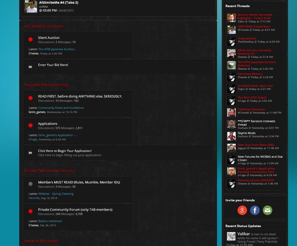
First of all, the new layout is sooo much better. Love it.
Is it intentional that bars for links are longer than others? Triggers my Monk senses.
Also if there is any cleanup (like deleting empty accounts that haven´t posted for over a year) that needs to be done, hit me up.
While we are on the topic of updating the page, I wanted to bring this to your attention.
The members tab (between What's New? and Events) up on the top does not take me to any page. It only gives me this message:
Fatal error: Allowed memory size of 134217728 bytes exhausted (tried to allocate 24809349 bytes) in /usr/www/alttabme/public/forum/library/Tapatalk/EventListener/Hook.php on line 42
I meant, doing it manually. If you give an option to mark it...I would have to run it through the DB versus the software
Fixed