


I love the subtle greys between the discussion lists aka a topic and replies.Love it so far, a bit on the grey side, but it's nice and easy on the eyes. ^^
The old site was actually a brighter white and it was killing me.
I like texture and light greys.
This delineates the posts clearer.
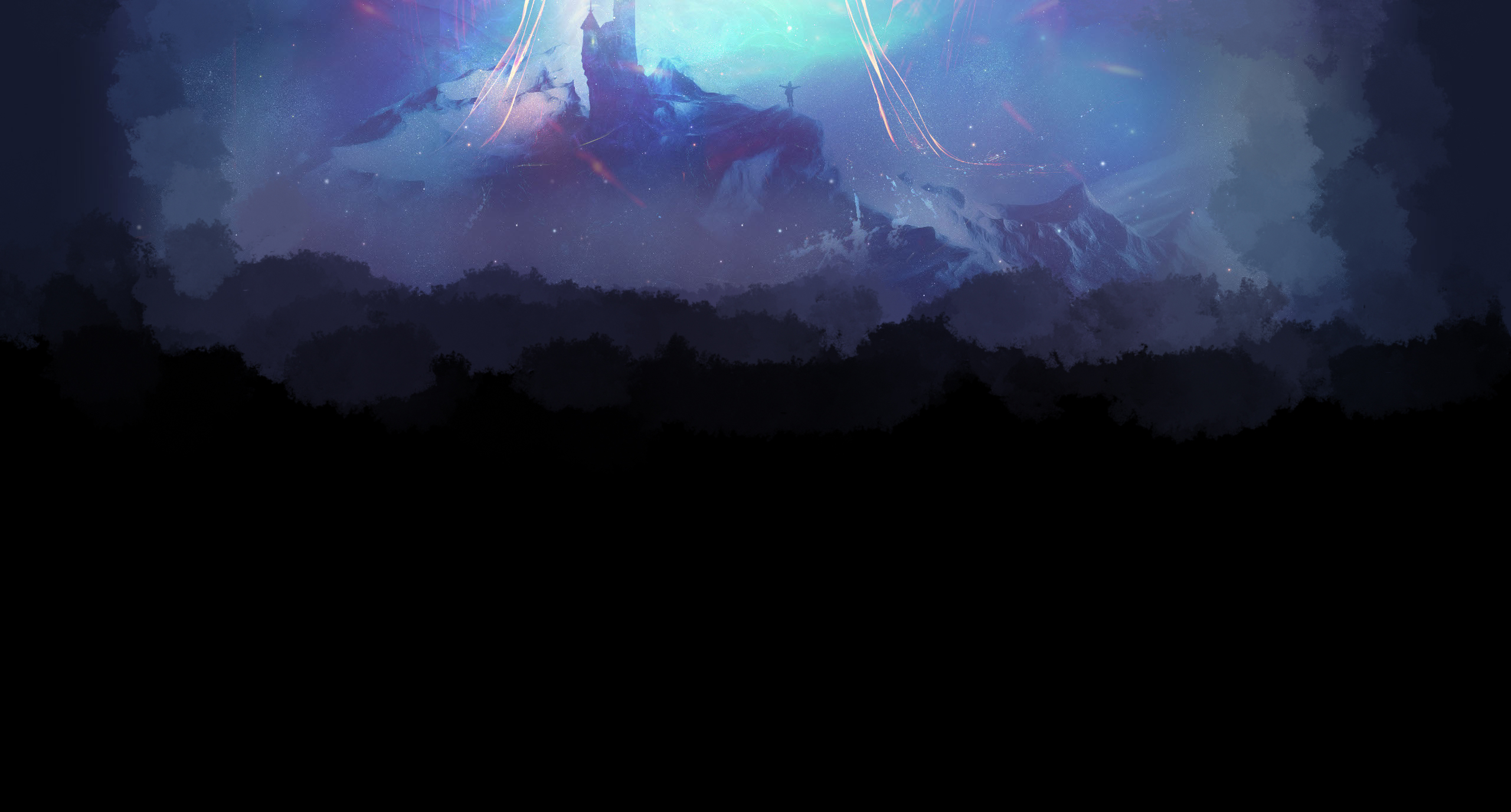
") The other site def had the same color scheme though. Just had a lot more bright white and the scuffed up background for the main page, which was just temp till I could figure out a cool BG. So All in all seems like it is shaping up nicely. Glad you said it is easy on the eyes makes me happy!
The other site def had the same color scheme though. Just had a lot more bright white and the scuffed up background for the main page, which was just temp till I could figure out a cool BG. So All in all seems like it is shaping up nicely. Glad you said it is easy on the eyes makes me happy!


